How might we help casual wine drinkers effectively choose wine off of a list or in store that match their taste and budget?
Problem
Outcome
I designed a high-fidelity prototype that makes wine discovery approachable and personalized.
Uncorked
A digital wine list guide that turns decision paralysis into confident choice, making wine approachable to the modern, younger consumer.
In class, I pitched a concept for a wine discovery app and it was voted the top idea to develop by my peers. Most wine apps cater to enthusiasts, not casual drinkers. I saw an opportunity to simplify decision-making, personalize recommendations, and make wine more approachable using familiar UX patterns especially for users who don’t speak the “language” of wine.
Product Designer
Role
Timeline
3 weeks
2 UX designers + 1 PD (me!)
Team
View Final Prototype
Why is the Wine Industry Struggling?
Results & findings
We conducted interviews with 5 casual wine drinkers and analyzed the UX of top competitors like Vivino. Across the board, users expressed confusion, frustration, and lack of trust:
Wine Doesn't Mix with the Modern Consumer
Most users didn’t understand flavor descriptors like “brambly” or “leathery” or even "dry"
Star ratings felt disconnected from user's actual taste because audience preference varies so widely
None of the apps made it easy to compare wines or learn personal preferences
It wasn’t just an information problem, it was a confidence problem. People wanted to learn, but the tools weren’t built for how they would actually choose a wine.
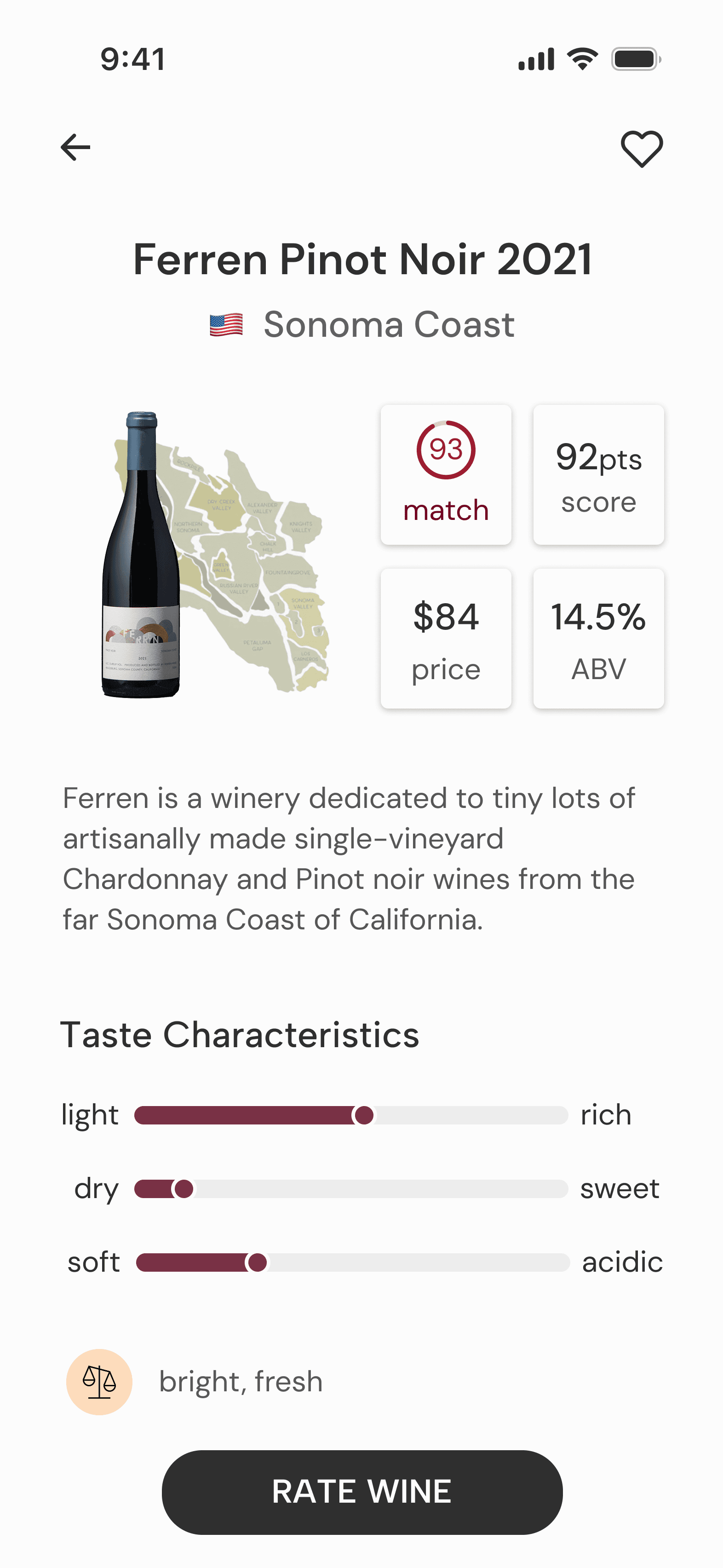
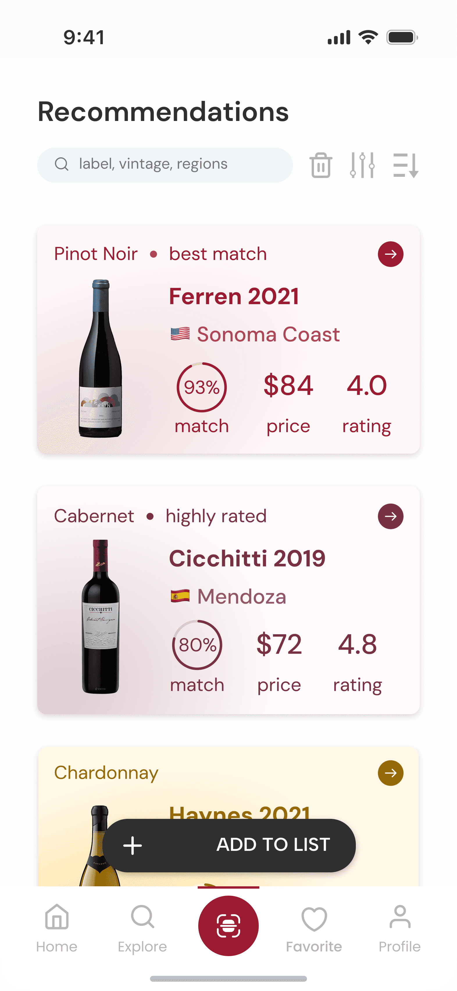
Insight: Choosing a wine felt like guesswork—users struggled to know what made one bottle better for them than another.
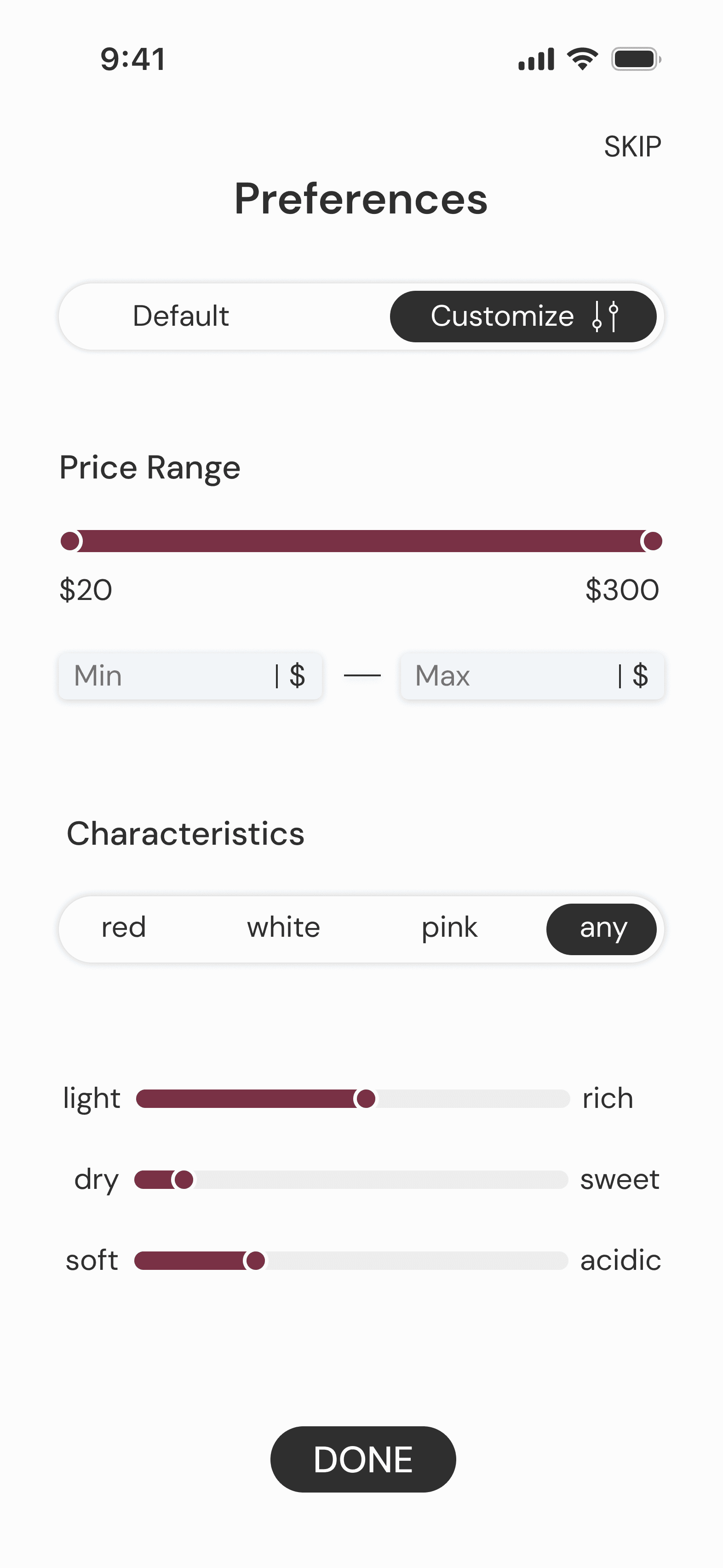
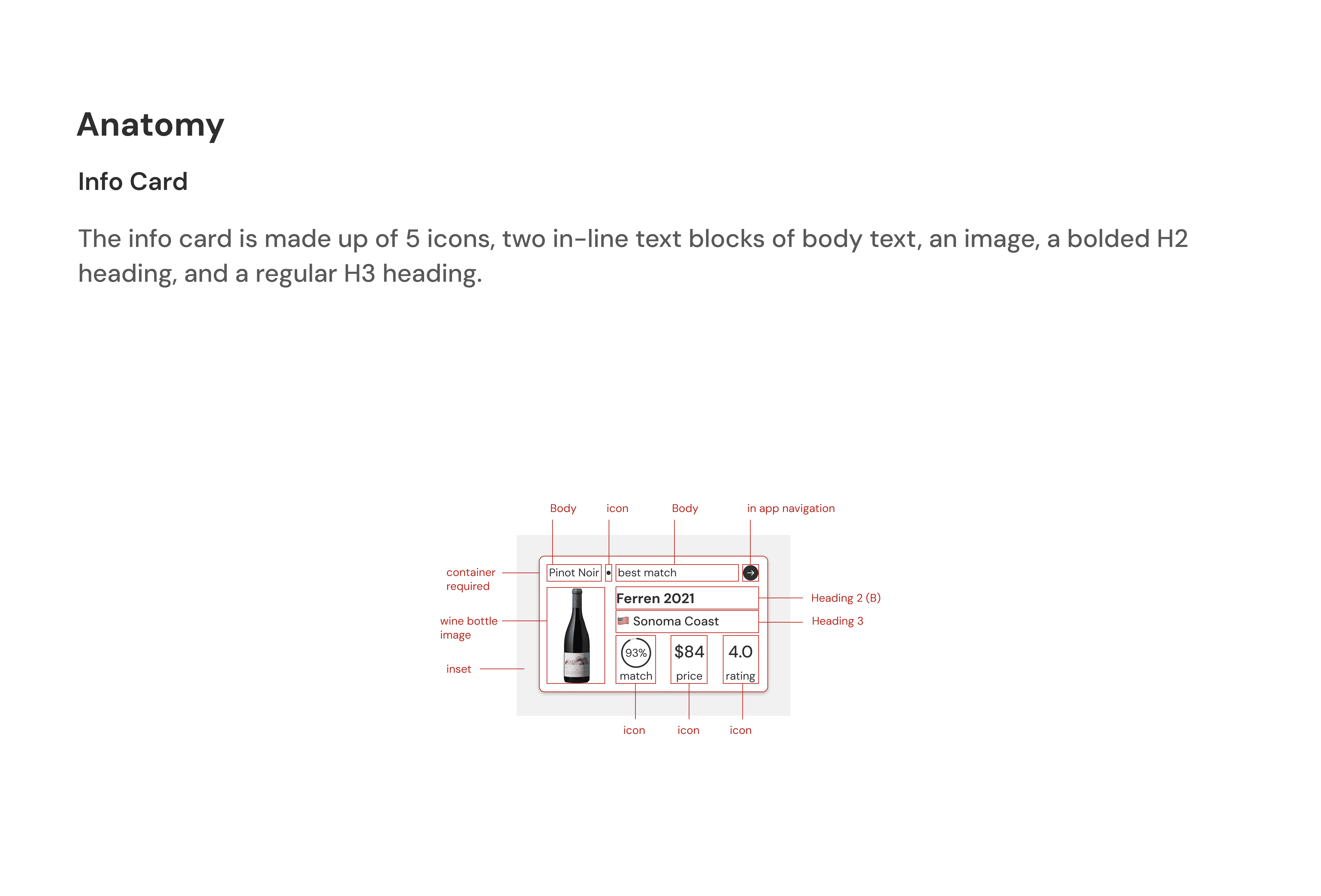
Decision: I introduced a side-by-side comparison feature so users could weigh wines by occasion, taste profile, and price.
Why It Mattered: This lowered decision friction and created a familiar, e-commerce-inspired experience. By comparing many options, users felt more confident about their choices and more likely to convert.
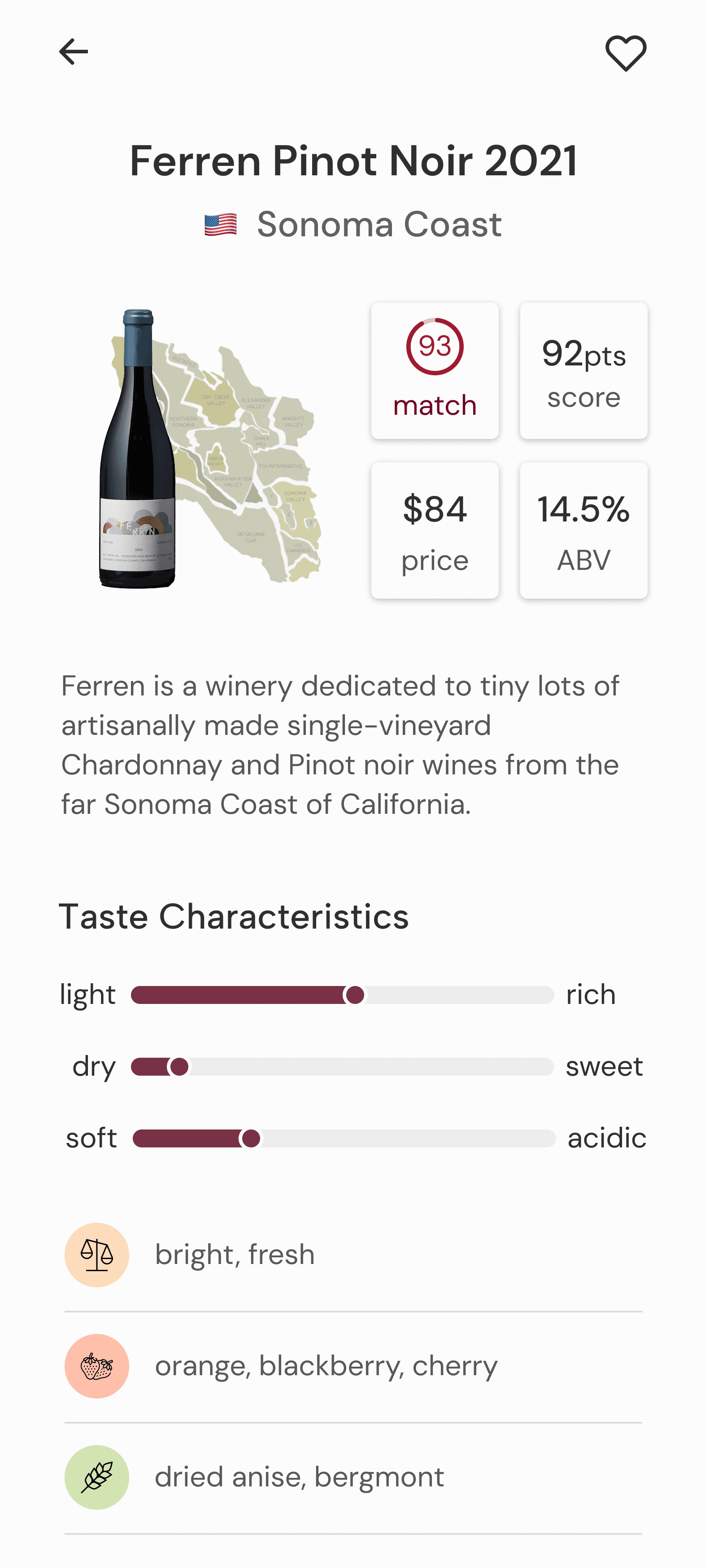
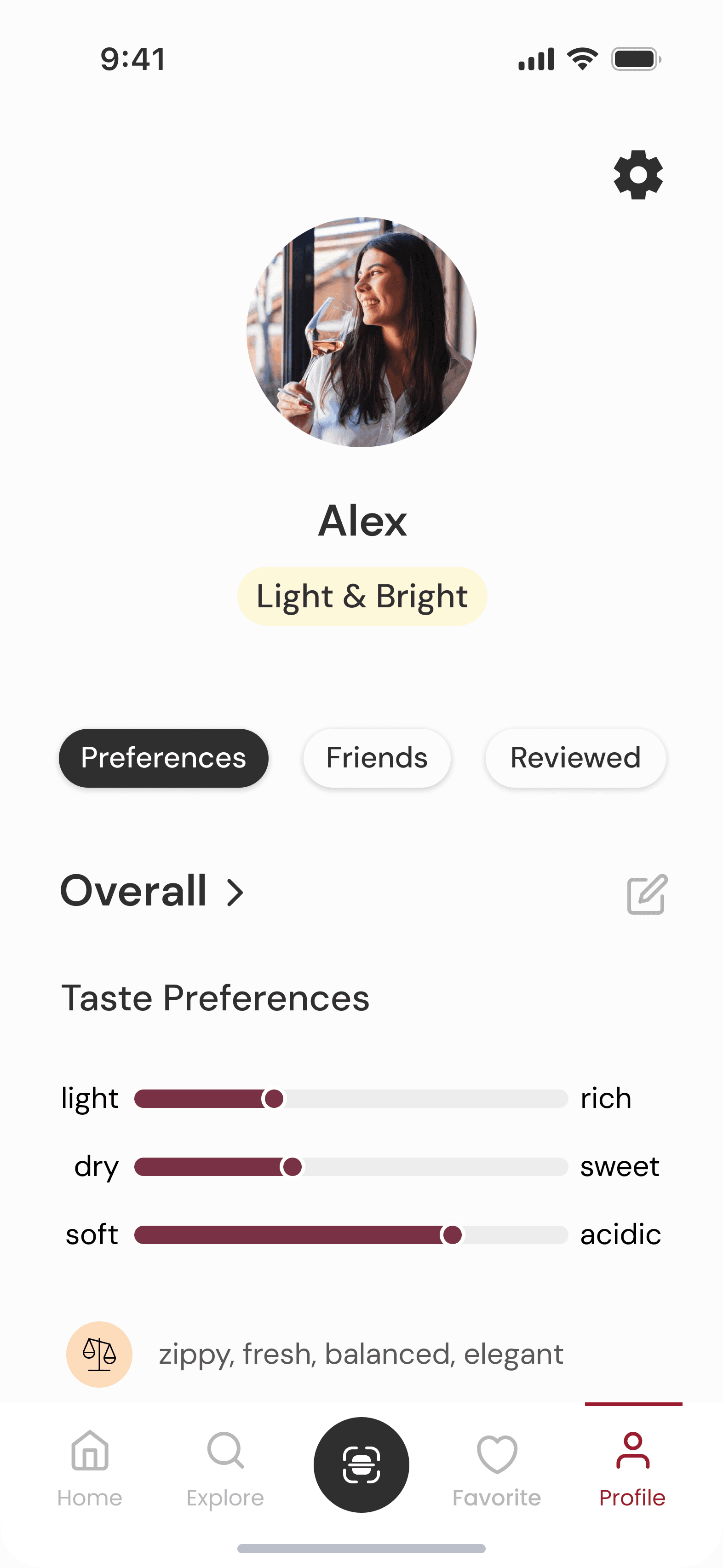
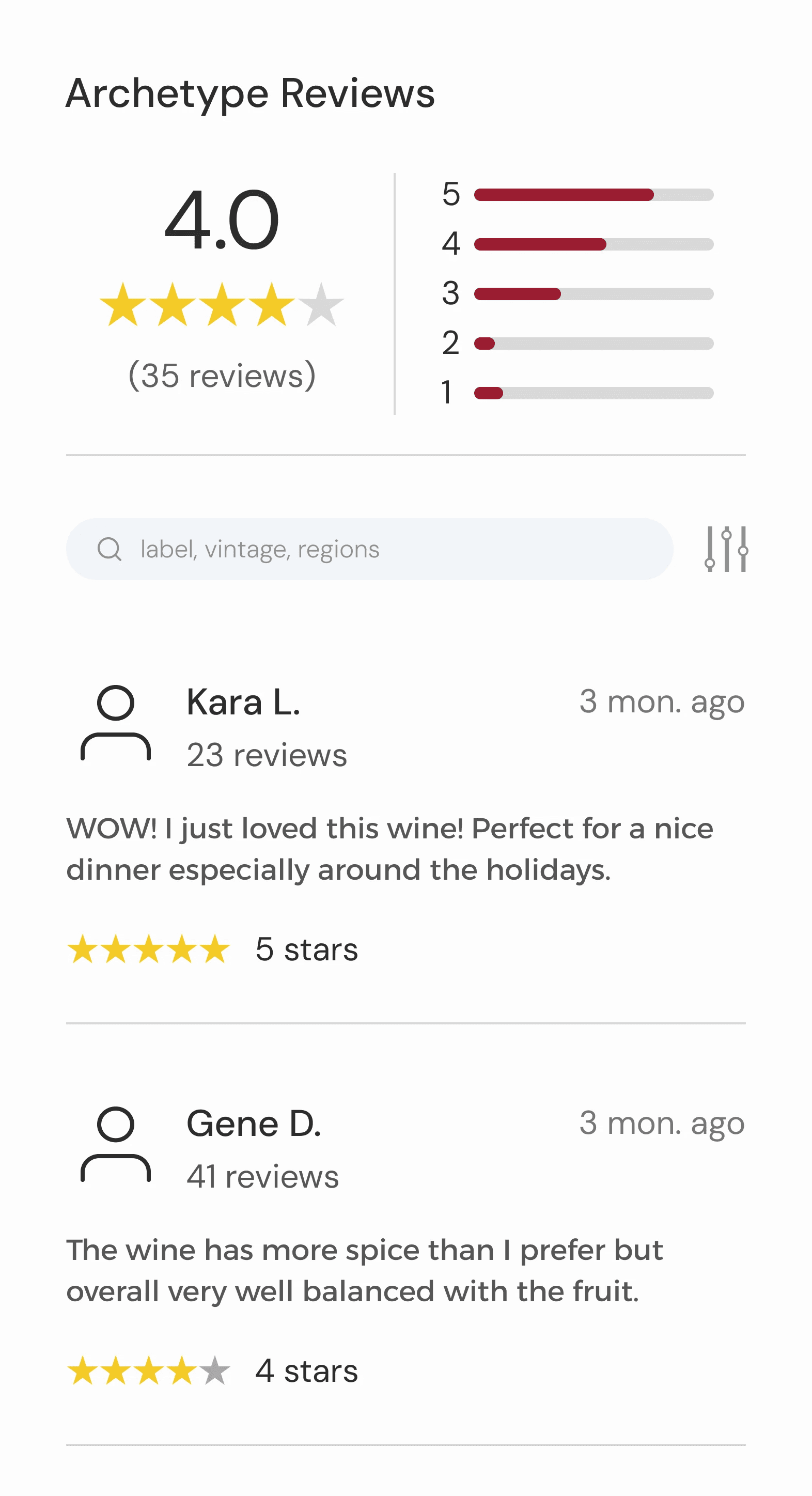
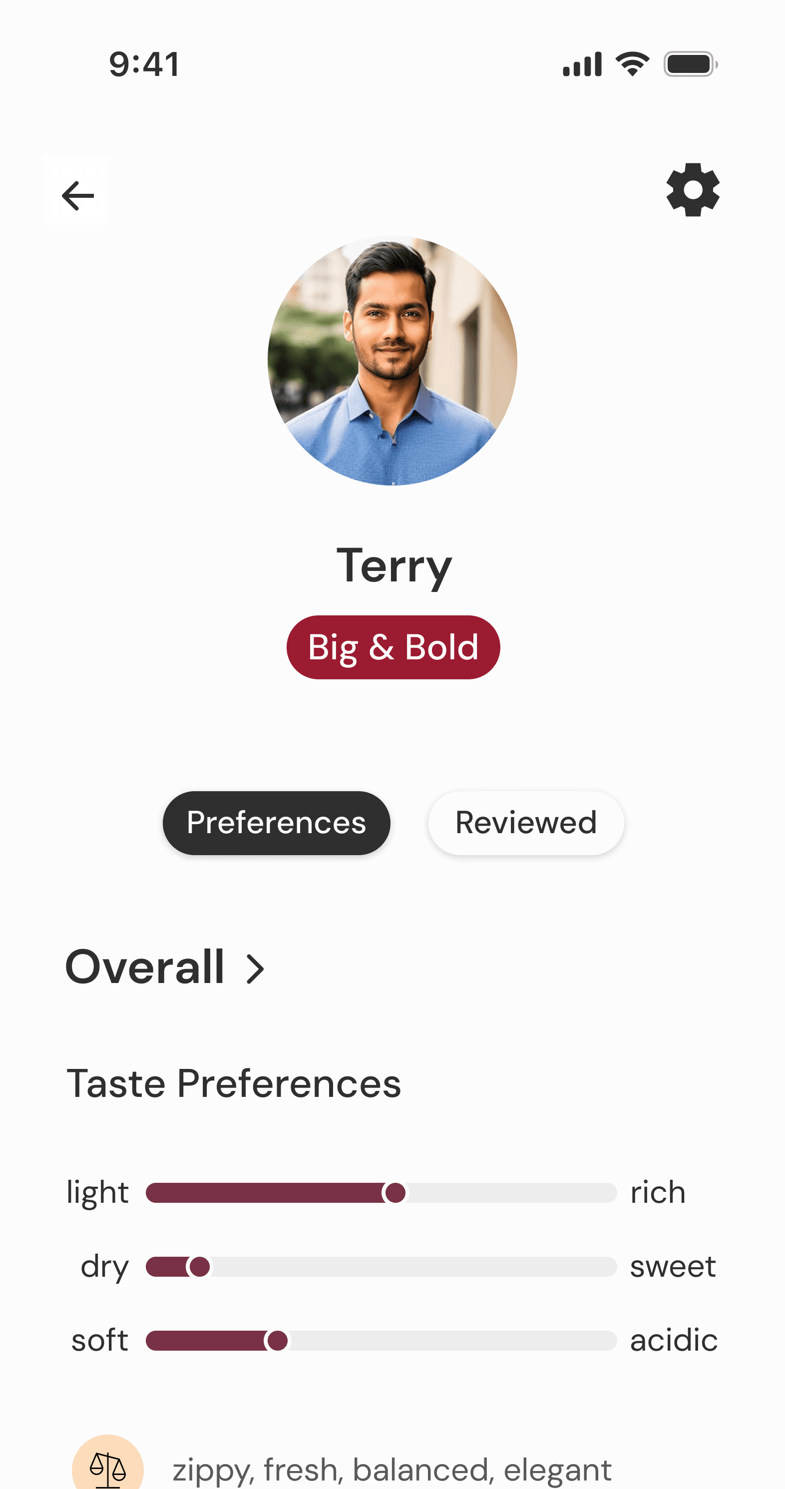
Insight: Star ratings weren’t helpful. Users consistently felt disappointed by a highly rated wine that just wasn't their taste. What users really wanted was a way to learn what they liked—not what everyone else did.
Decision: I replaced universal ratings with taste sliders that allowed users to build their own flavor profile (e.g., light–rich, dry–sweet).
Why It Mattered: This transformed Uncorked into a smart companion that got better with use—turning feedback into increasingly accurate recommendations that felt tailored, not generic.

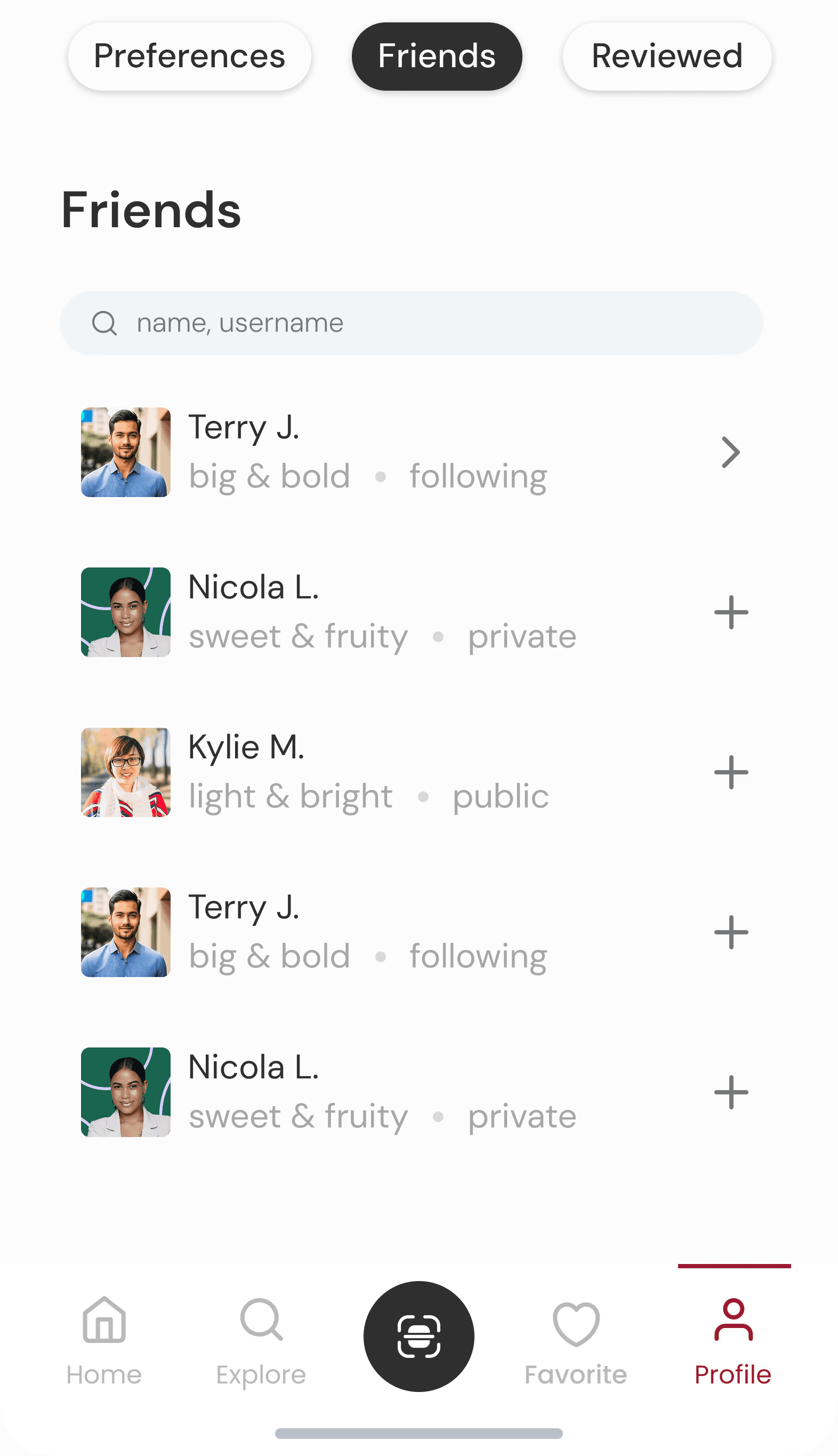
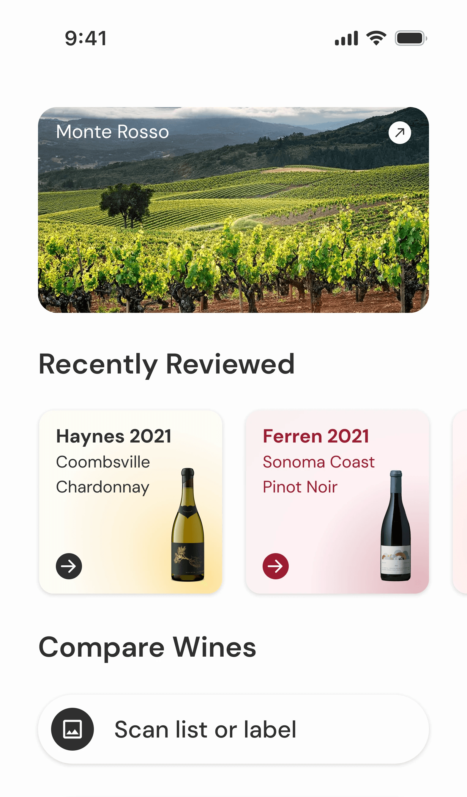
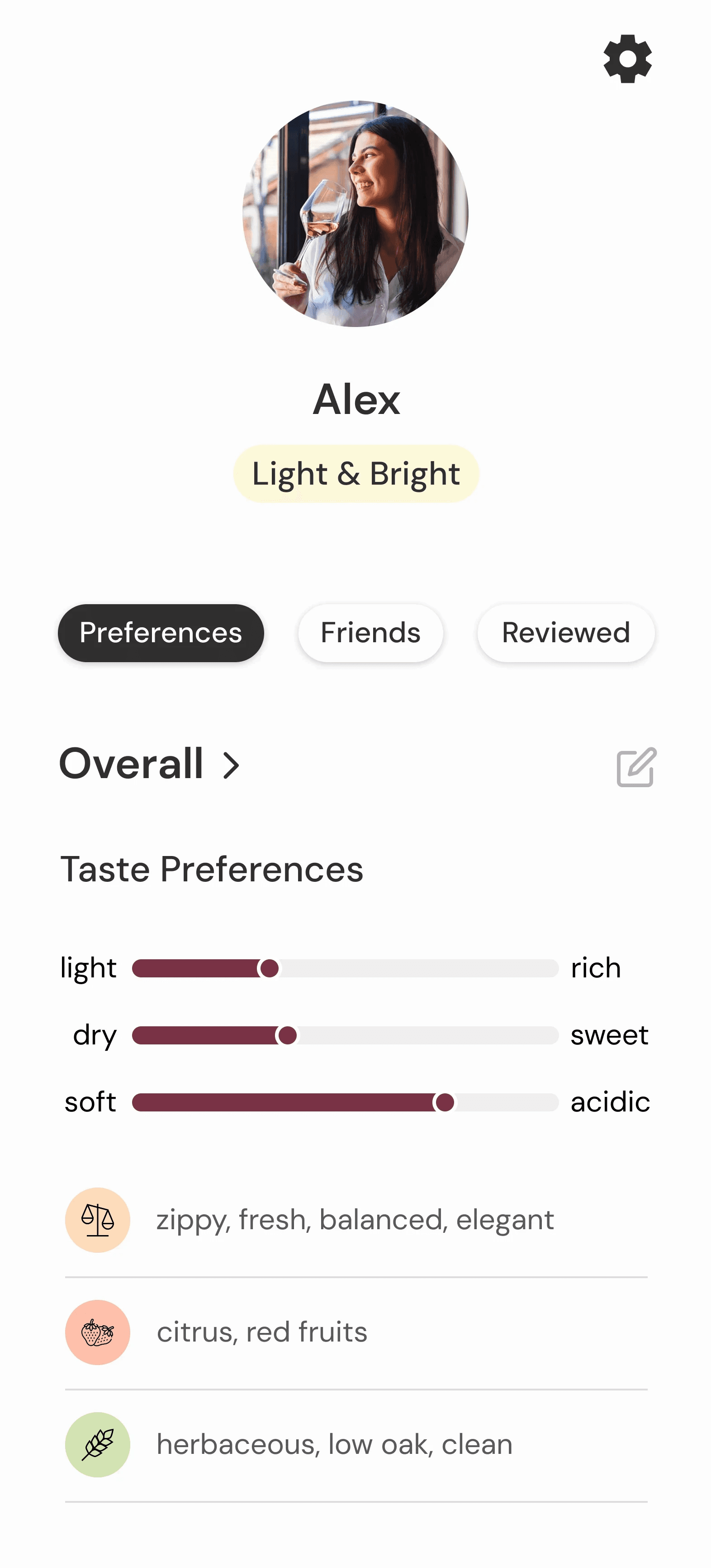
Insight: Users trusted friends more than critics, but current apps didn’t let them connect.
Decision: I designed a recommendation system that shows reviews from users with similar taste archetypes (like “light & bright” or “big & bold”) and lets users add friends to see what wines they have tried and liked.
Why It Mattered: This built trust and discovery into the social fabric of the app. Instead of relying on gatekeeping experts, users could learn from each other—creating a more inclusive, collaborative experience.
Feature 3:
Make Wine Social, Not Snobby
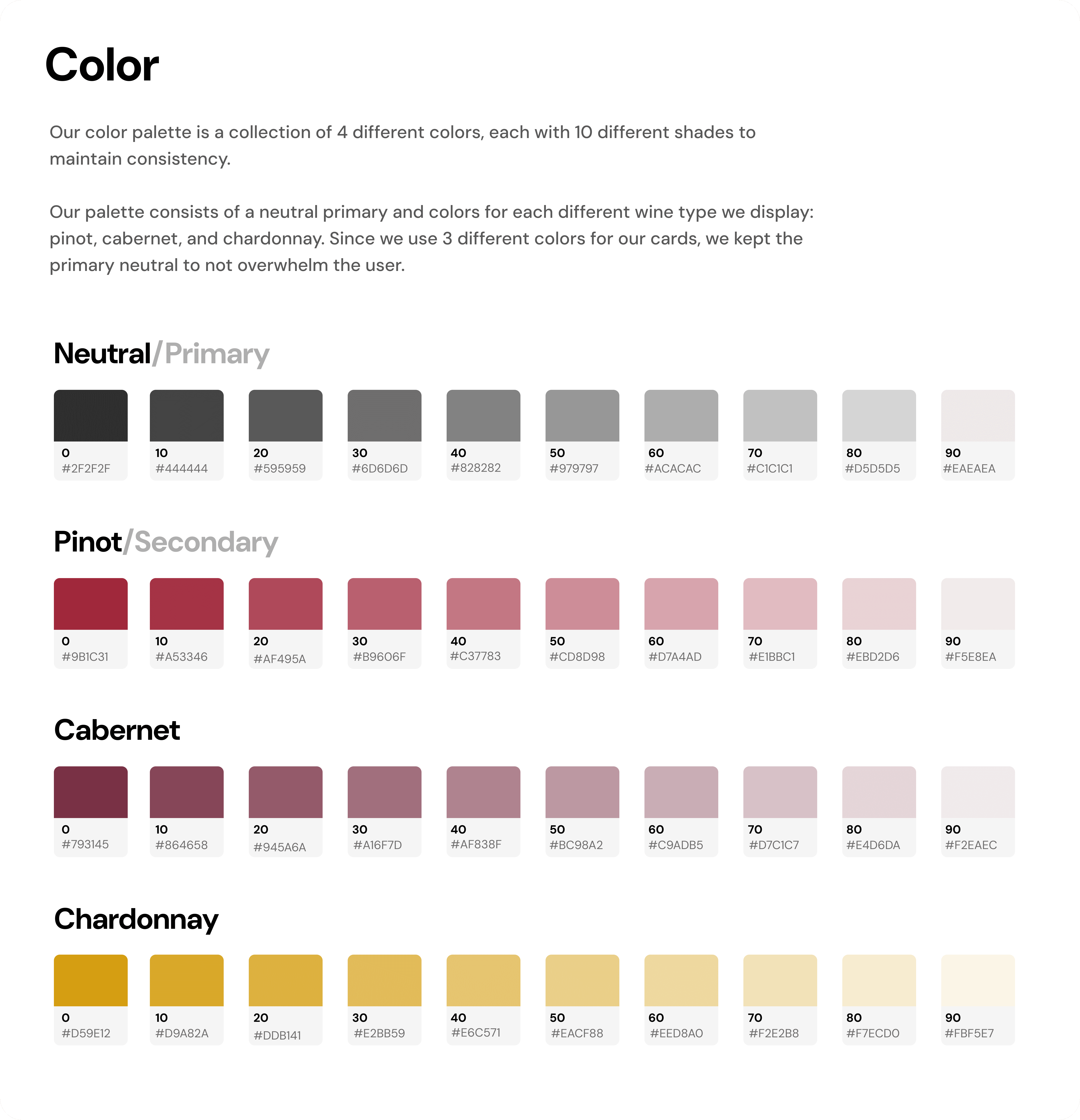
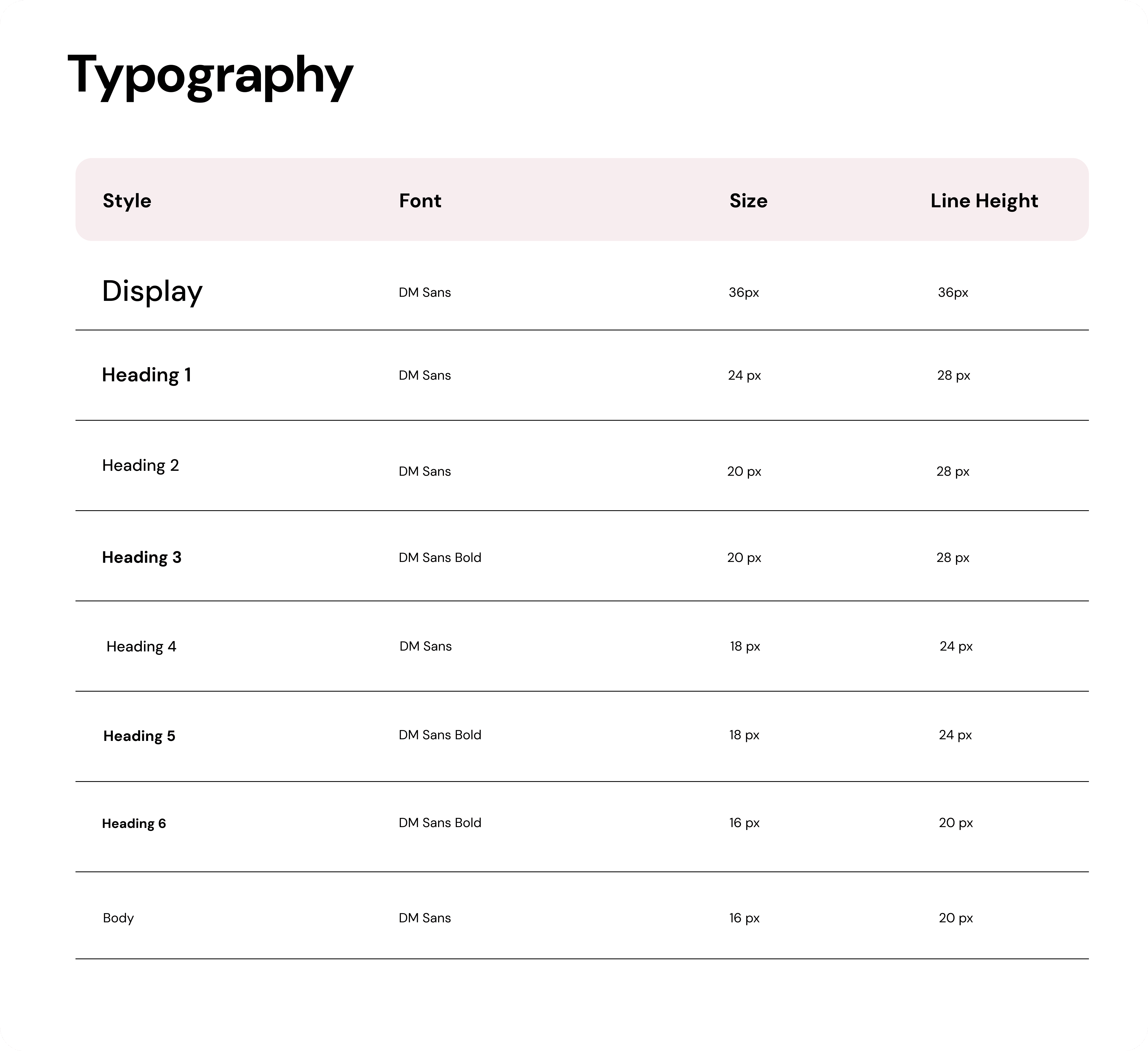
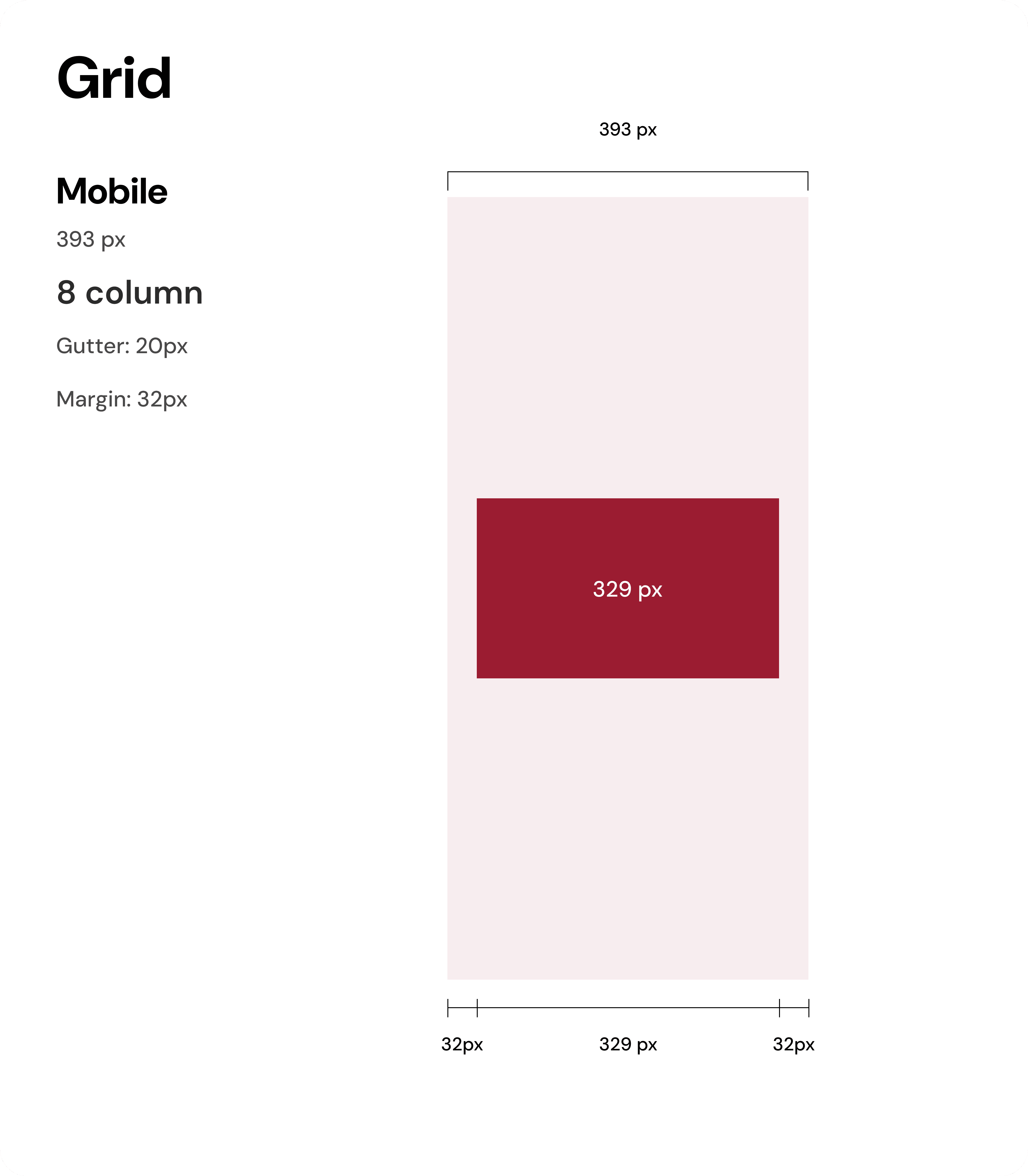
Creating design documentation, style guide, and design system
I found design documentation surprisingly rewarding. I began with the tokens and moved swiftly into the components and icons, finishing with documentation.

Projected Impact