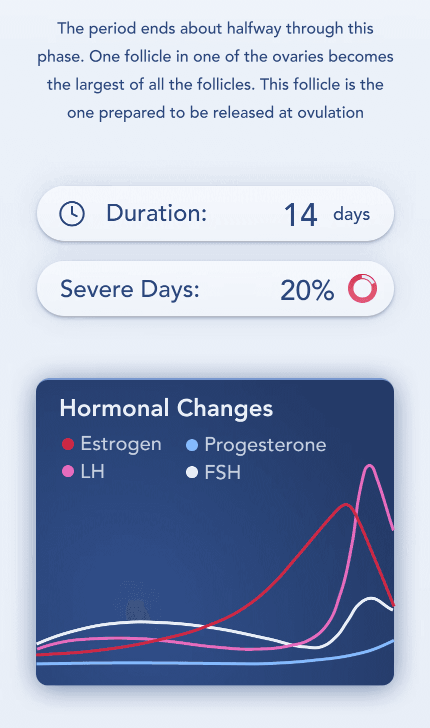
Early user testing revealed another challenge: too much text, not enough clarity. Reproductive health data is complex, and overwhelming users with long explanations wasn’t the answer. So, we turned dense information into intuitive visuals.
Graphs allowed users to instantly spot trends, track hormonal fluctuations, and anticipate symptoms without needing to wade through paragraphs of medical text.More than just improving usability, data visualization built trust. When users could see patterns for themselves, they felt more confident in the app’s insights. This approach transformed cycle tracking from a static log into an interactive, personalized health tool.
Earning Trust Through Simplicity: How Graphs Made Data Accessible